A travel insurance application for a young target audience. Without long bureaucratic processes, fun and swift.
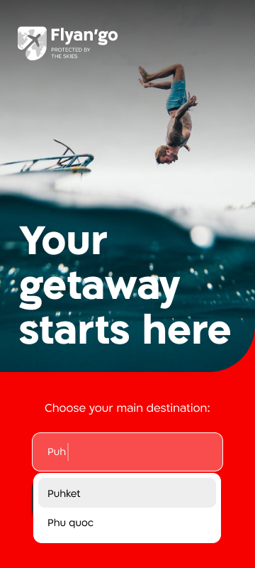
Flyan‘go – the travel insurance app designed for young explorers on the go! Planning a spontaneous getaway or heading out for an adventure? Flyango’s got your back. Effortlessly customize your coverage, get instant quotes, and secure your travel plans in a flash. Flyan‘go app is tailored for those in a hurry, offering a seamless experience from purchase to policy details, all at the speed of your travels.
Cumbersome Bureaucratic Processes: Lengthy and frustrating administrative procedures often deter individuals from engaging with insurance matters due to the perceived complexity and lack of clarity.
Underutilization of Additional Features: The company’s revenue model relies on selling supplemental features, yet a considerable number of individuals forego these options due to an interface perceived as unfriendly and overly intricate.
Proposed Solutions
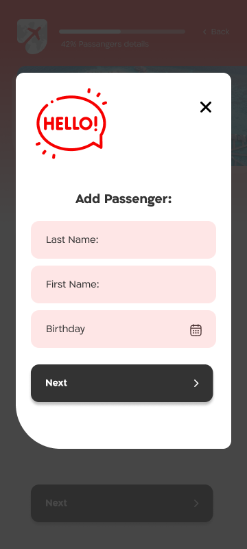
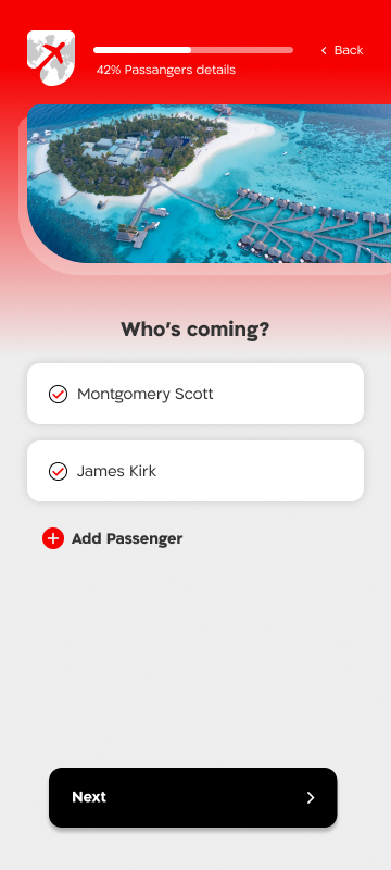
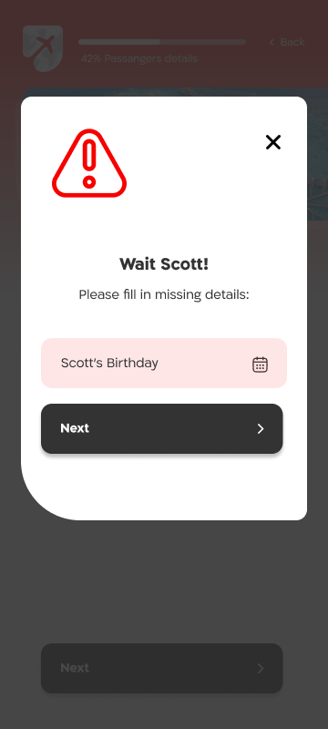
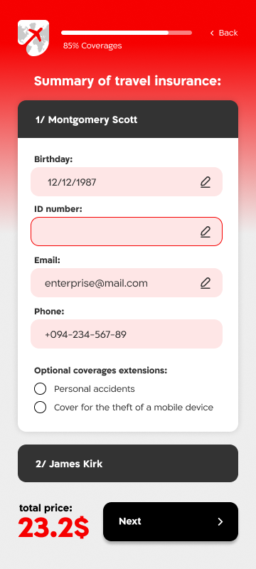
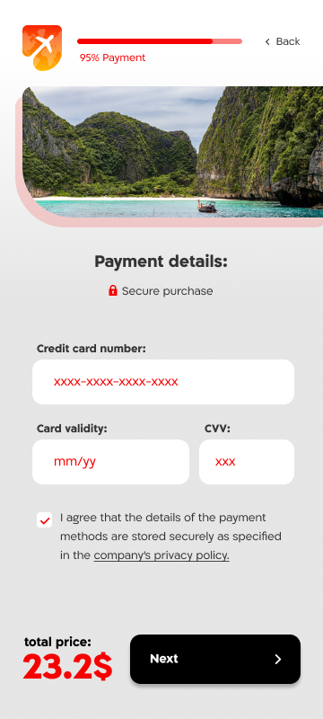
Implement a user-friendly interface with a step-by-step guide for insurance processes, breaking down complex procedures into manageable steps. Provide clear explanations and use plain language to enhance understanding.
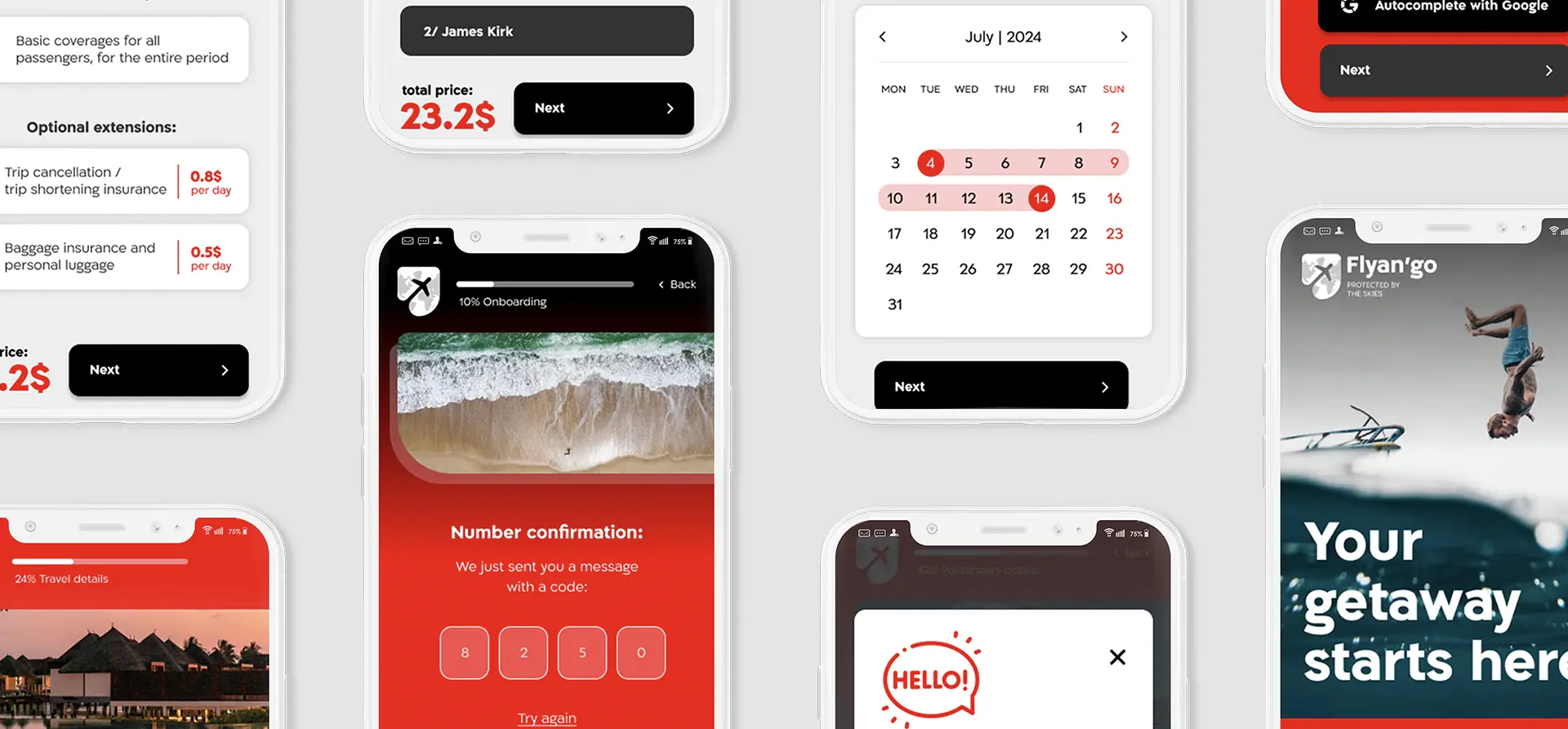
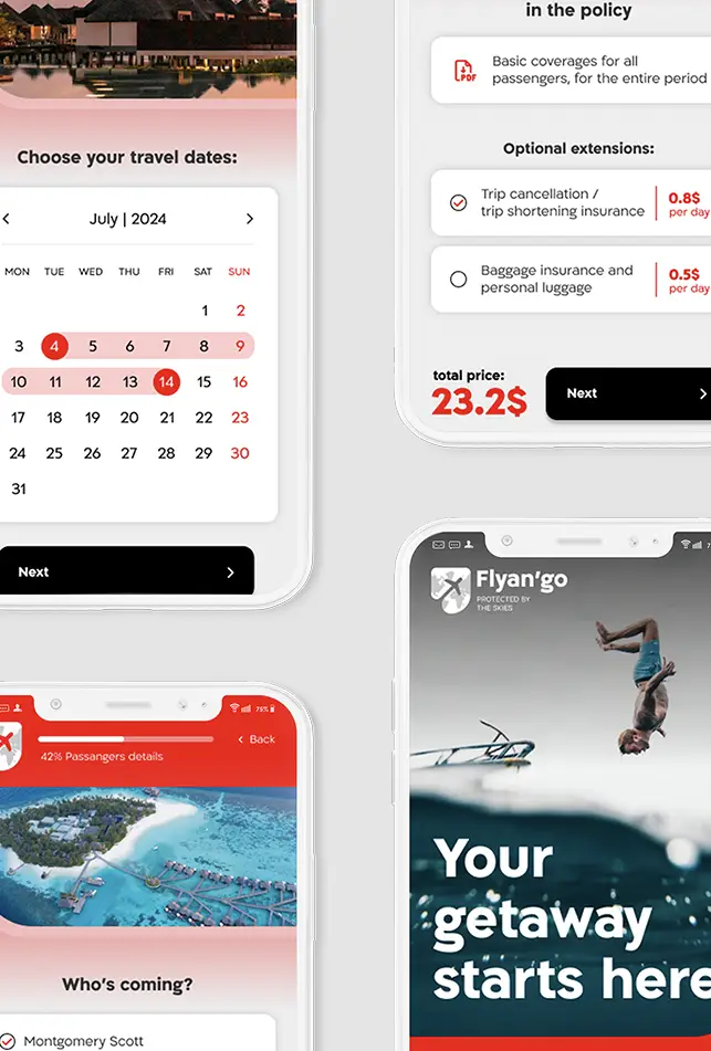
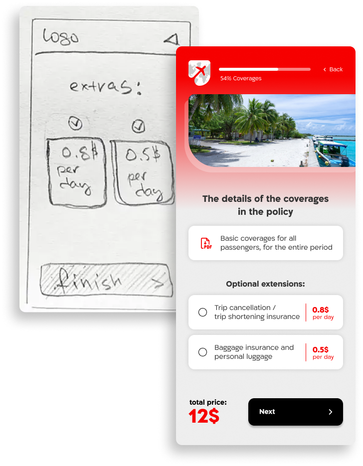
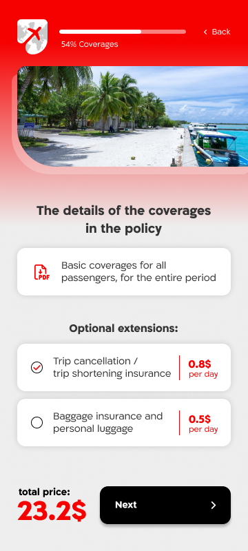
Revamp the interface to make it more intuitive and user-friendly, ensuring that users easily comprehend the benefits of additional features. Breaking down the total cost per day to minimize reluctance during the purchase process.
The testing yielded positive results, with testers successfully completing the majority of tasks at a rate of 70% or higher.
While my primary role is to advocate for the user and address their needs, it is equally important to listen to the needs of the company.
Building a Framework for Design
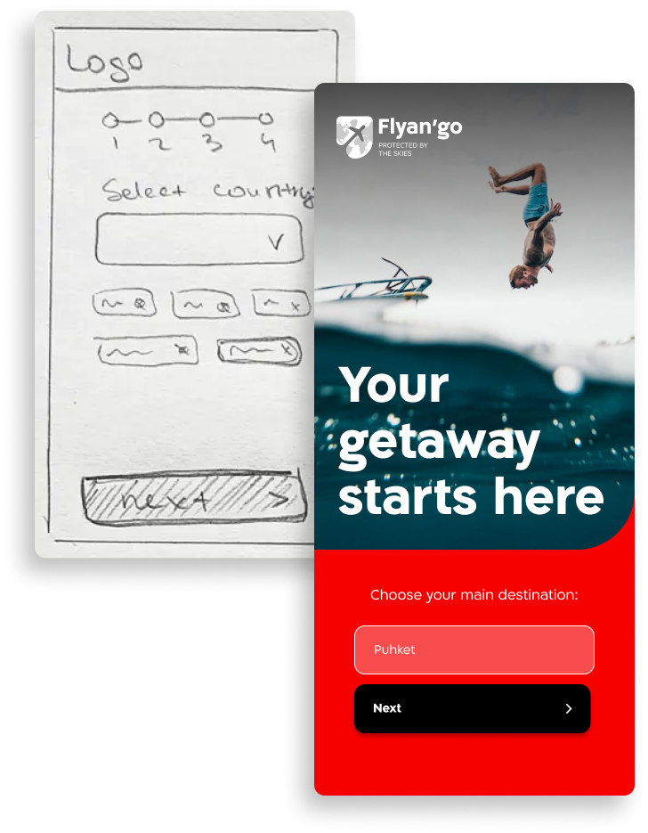
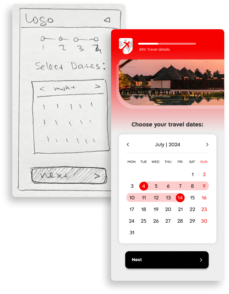
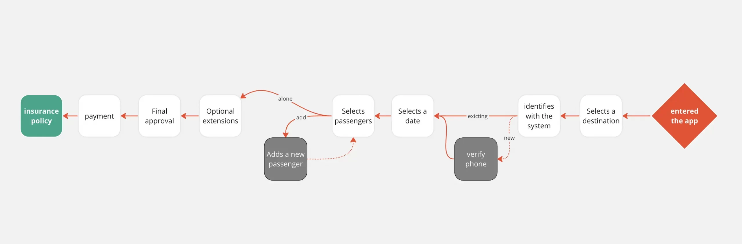
Analyzing the low-fidelity prototype provided insights into users’ task expectations. Through observing touch and swipe interactions and engaging in discussions about their expectations, I gained clarity on necessary adjustments for developing a comprehensive high-fidelity prototype. Details like consistent iconography for actions and clear navigation paths emerged as crucial components for the design system.
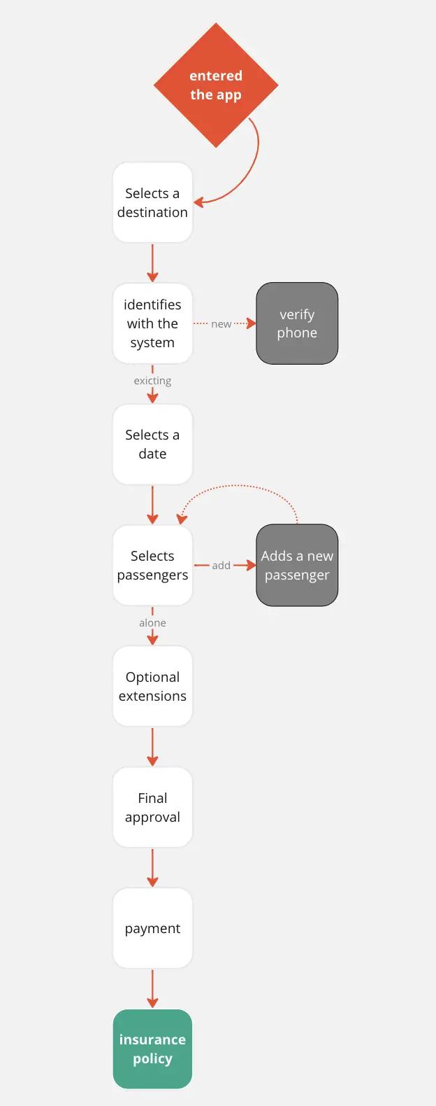
Visualizing a User-Centric Experience
Prior to delving into the appearance and style of the interface, I meticulously constructed a seamless flow of screens. This process was informed by comprehensive user research and insights gathered from the company’s customer journeys.
Lessons Learned
Balancing the needs of both users and the company is crucial as an interface designer. While my primary role is to advocate for the user and address their needs, it is equally important to listen to the needs of the company. Often, their requirements align, allowing for shared solutions.
Breaking down complex processes into stages and utilizing tailored copy for the target audience are vital ingredients for success. By visually and conceptually decoding lengthy procedures, we can make them more approachable and alleviate user concerns. This approach effectively addresses various pain points experienced by users.