Application for Communication Management Between Teachers and Parents of Elementary School Students
In the digital era, we are accustomed to having all information at our fingertips. Therefore, in the case of communication between schools and parents of young students, it seems most logical to transition to digital means. Solutions like these have existed for some time, with some even initiated by the Ministry of Education itself and mandated for use in various schools.
Nevertheless, many teachers and parents prefer using applications that are not officially designated as the school’s communication medium, such as the popular chat application WhatsApp. From one perspective, “Nilmada” offers a more professional and secure communication experience, while on the other hand, it is more accessible compared to its competitors. Additionally, it provides additional values of educational experiences and a sense of belonging to the school community.
The current application is complex to operate for both parents and teachers.
It does not provide additional value beyond receiving messages from teachers.
Proposed Solutions
Conducting a user review, both from teachers and parents, is aimed at examining the situations in which they consume current application and what they expect to receive from it.
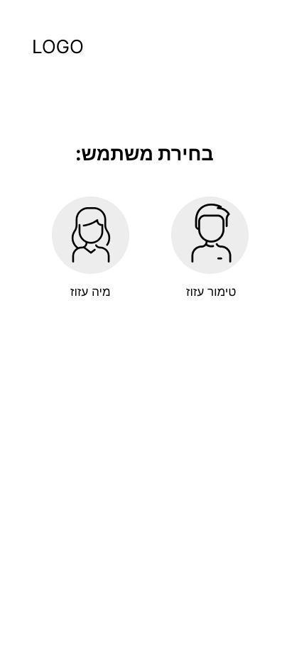
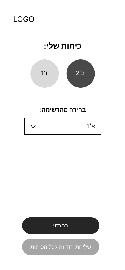
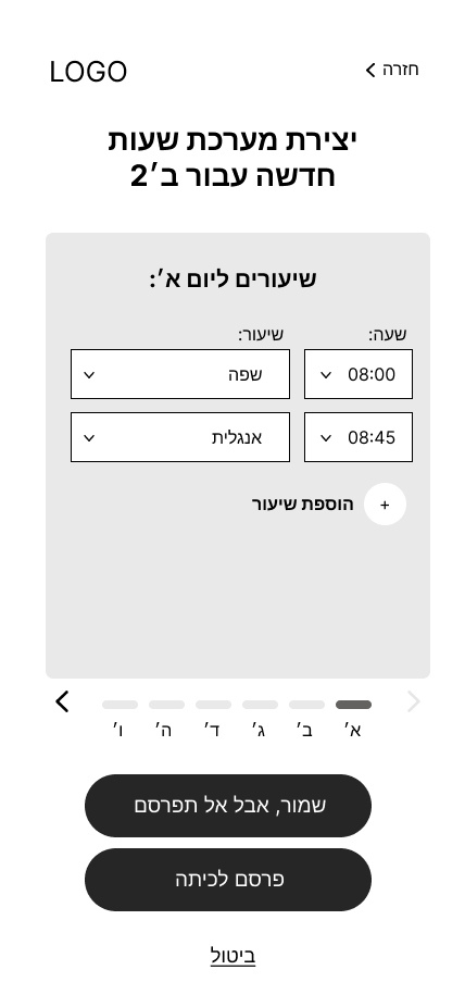
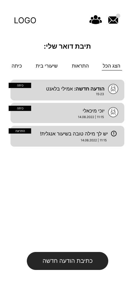
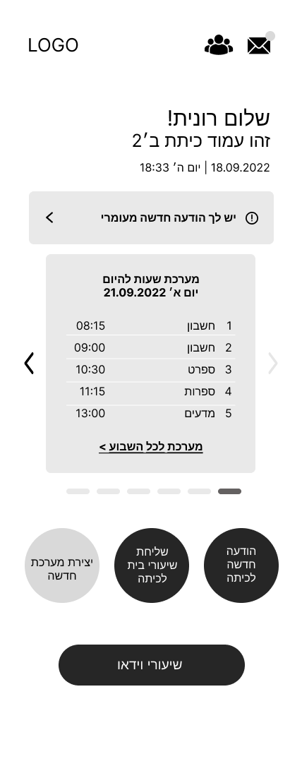
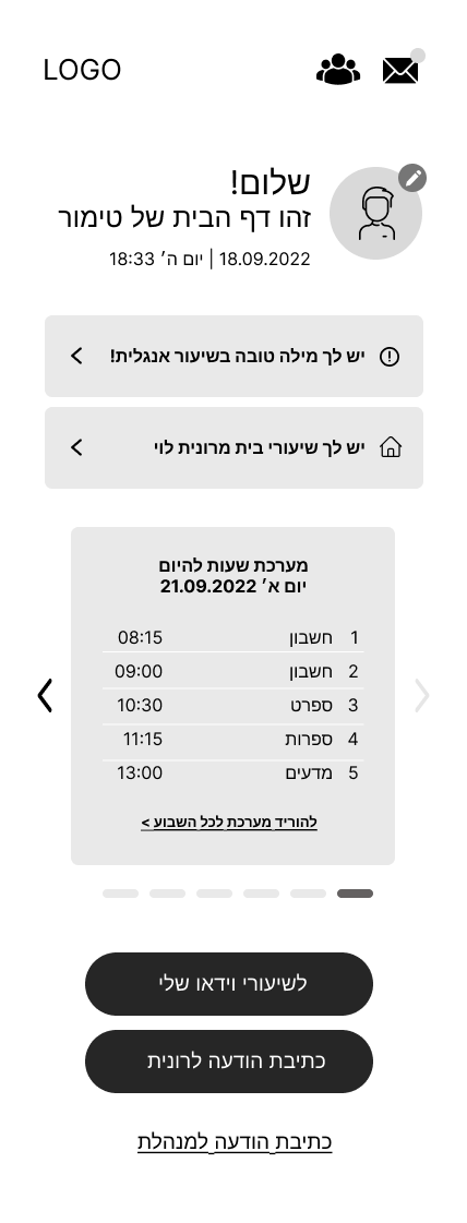
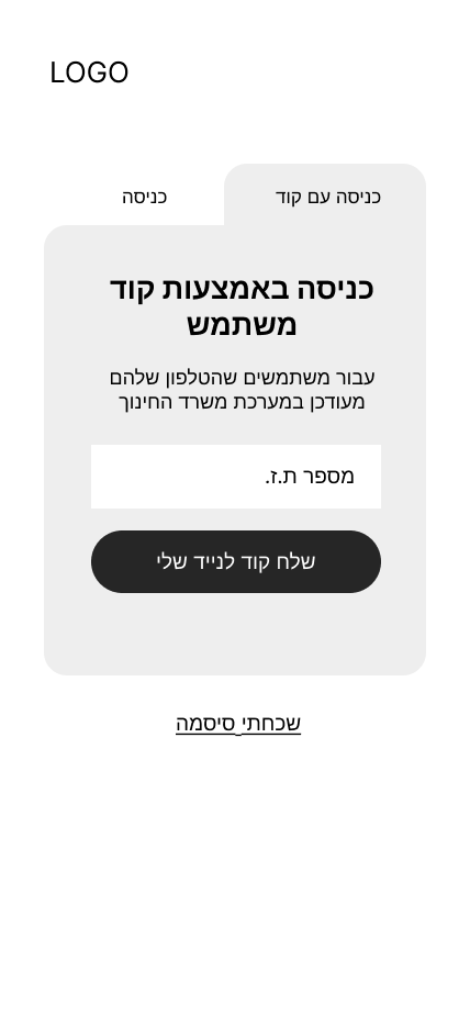
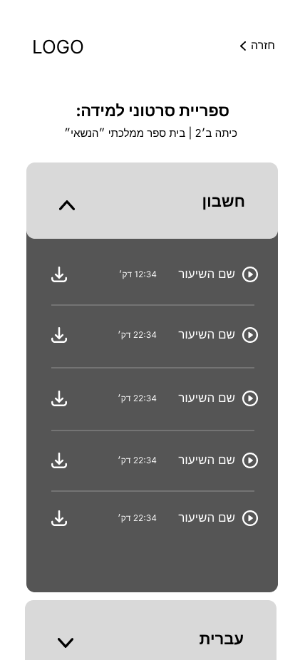
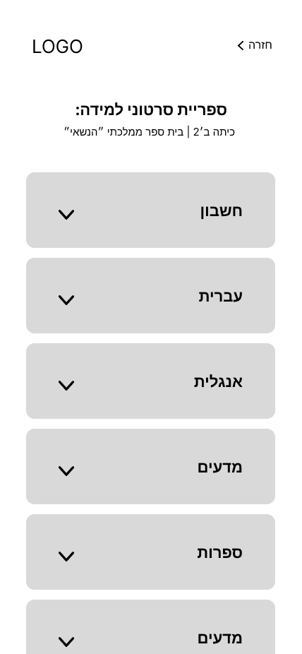
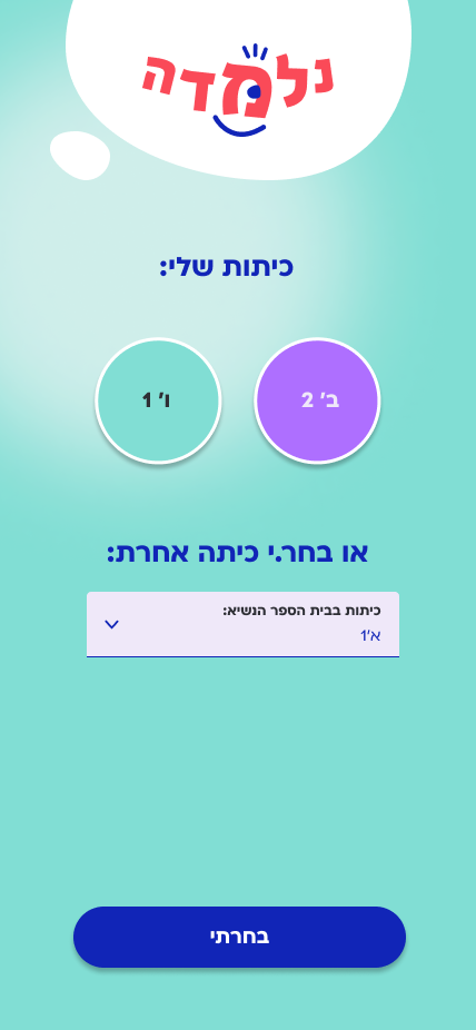
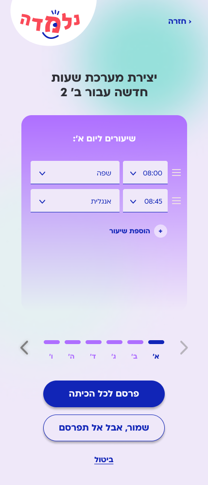
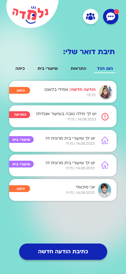
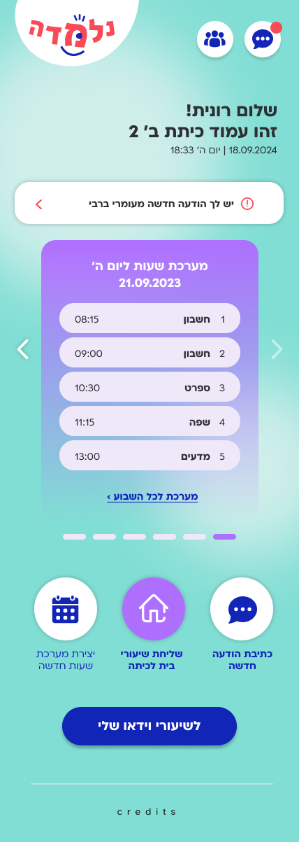
The creation of an accessible user interface, that is intended to enable quick access to relevant information and provide additional value beyond simple communication.
Most of the users I tested want to use an application that connects parents and teachers, but have difficulty doing so because of a complicated interface.
Getting Closer to User-Centered Design
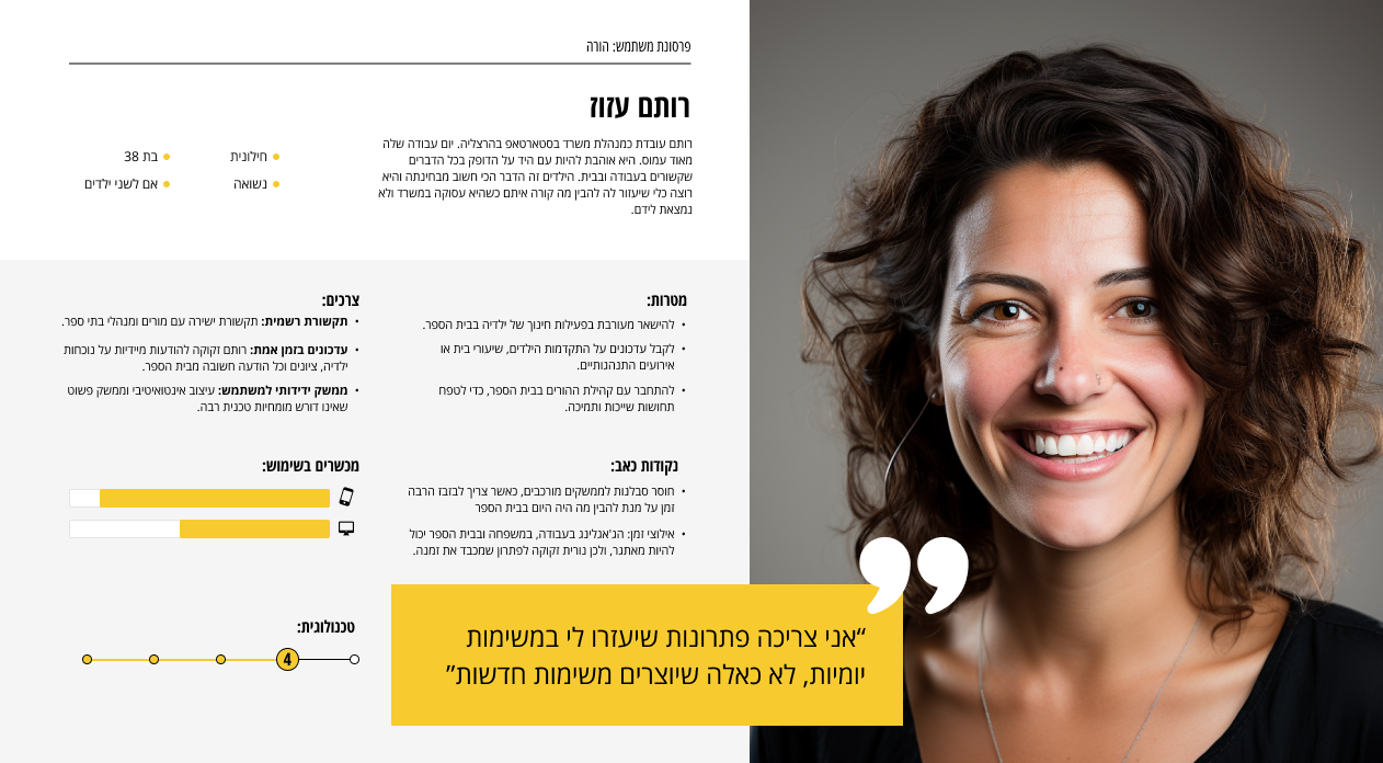
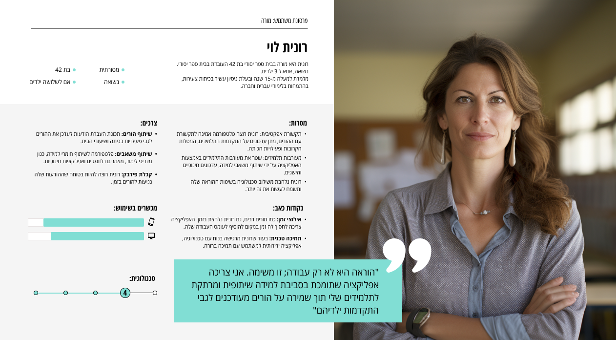
Defining Key Differences in Motivations Through Personas
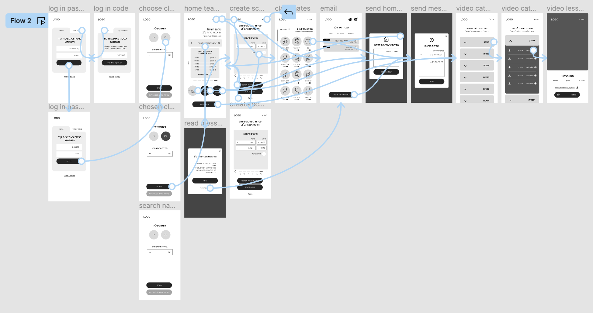
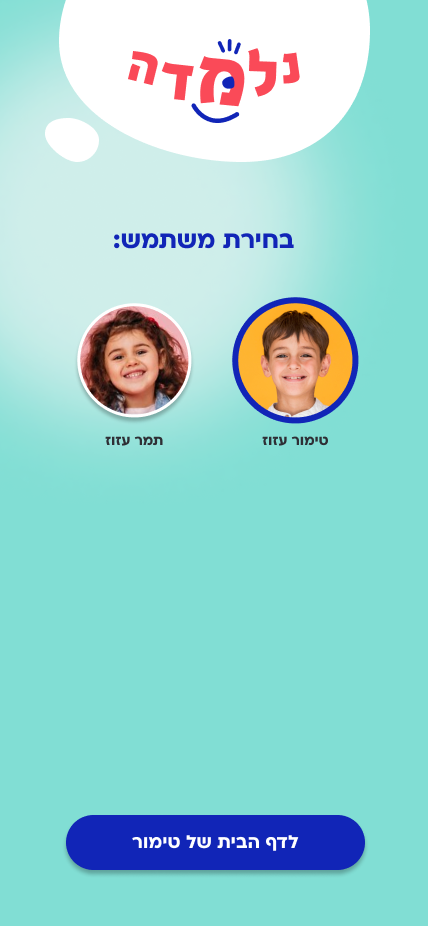
One of my assumptions was that children are also a relevant target audience for the application, but after examination, I realized that this is not accurate. Parents want to stay in the loop despite their busy work schedules and daily routines.
Creating Structure
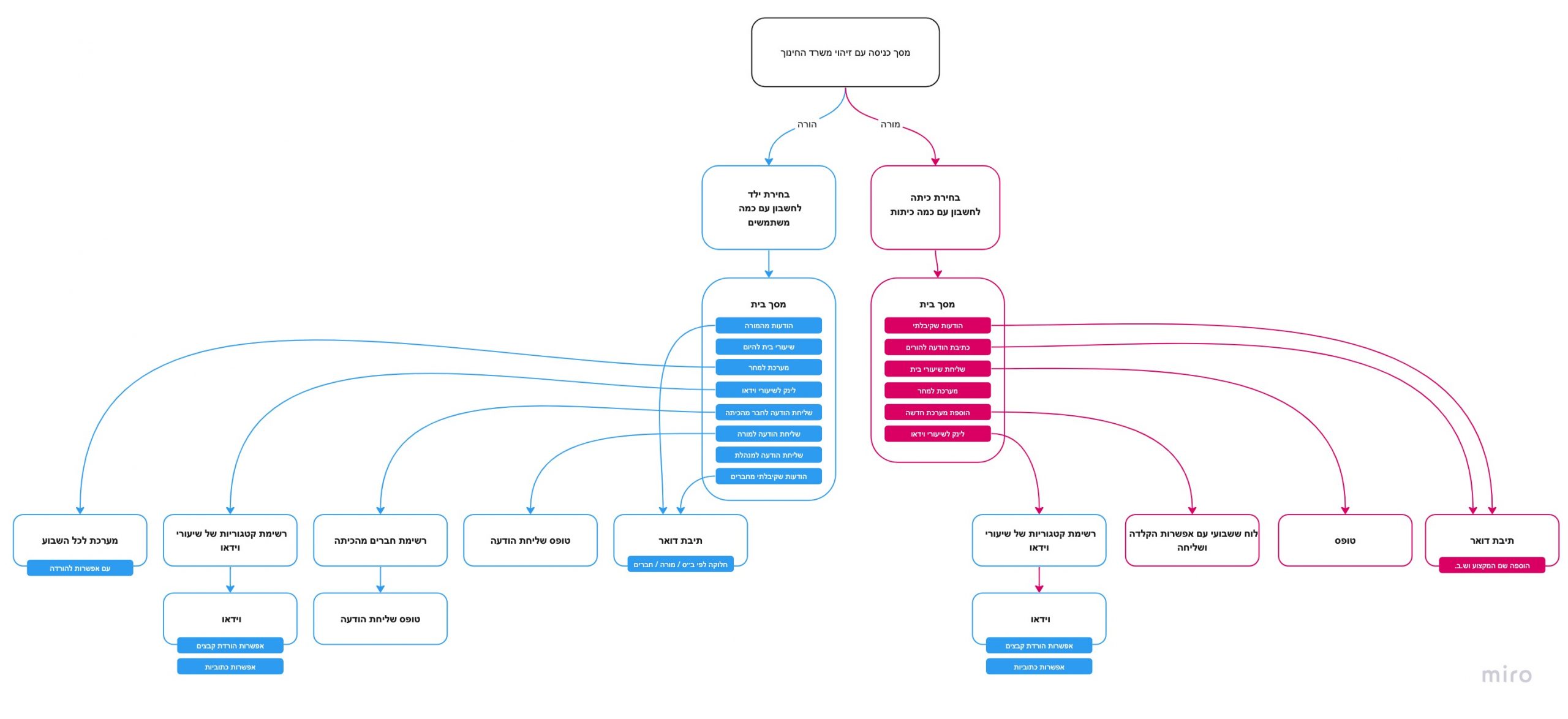
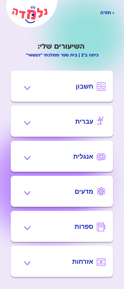
This sitemap illustrates the branching of user types immediately after logging into the system. The framework the site map provides, along with the user insight collected thus far, would guide design decisions moving forward.
Visualizing a User-Centric Experience
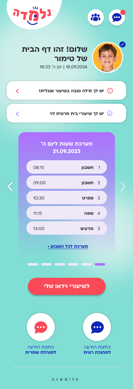
By exploring the organization of pages through sketching, I have learned that the most effective approach forward is through a homepage that includes links to all the relevant information for the user.
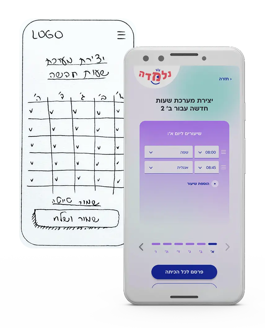
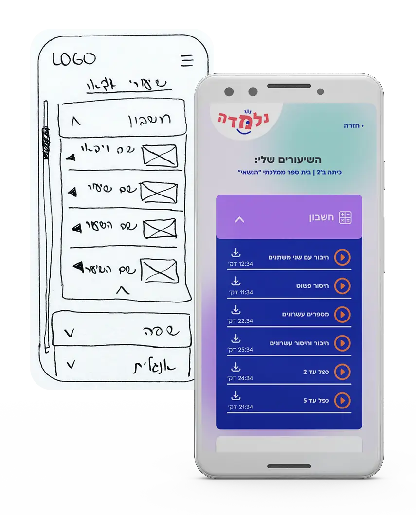
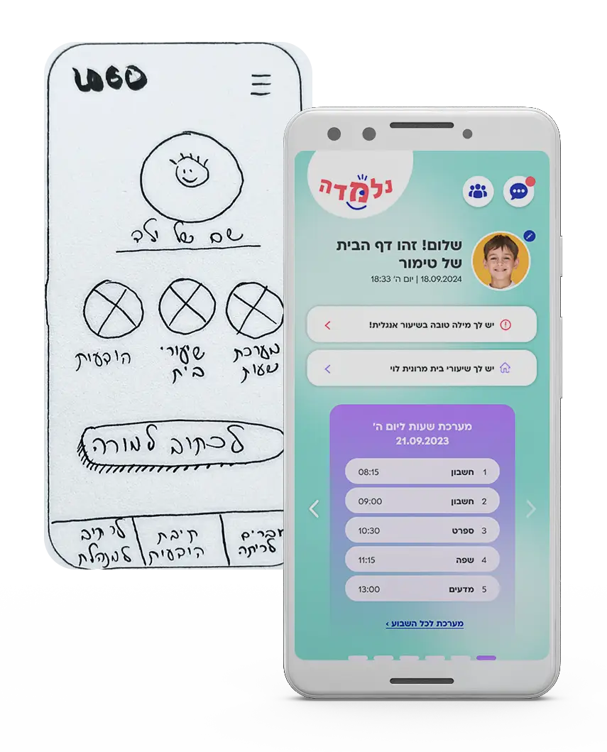
Building a Framework for Design
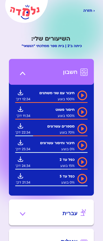
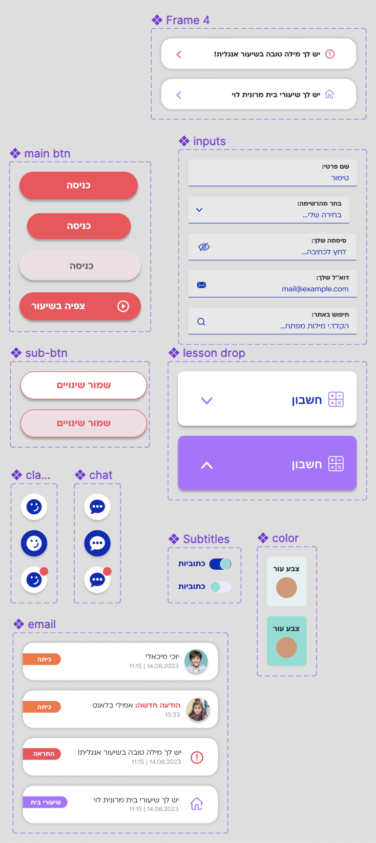
Analyzing the low-fidelity prototype provided insights into users’ task expectations. Through observing touch and swipe interactions and engaging in discussions about their expectations, I gained clarity on necessary adjustments for developing a comprehensive high-fidelity prototype. Details like consistent iconography for actions and clear navigation paths emerged as crucial components for the design system.
The testing yielded positive results, with testers successfully completing the majority of tasks at a rate of 72% or higher.
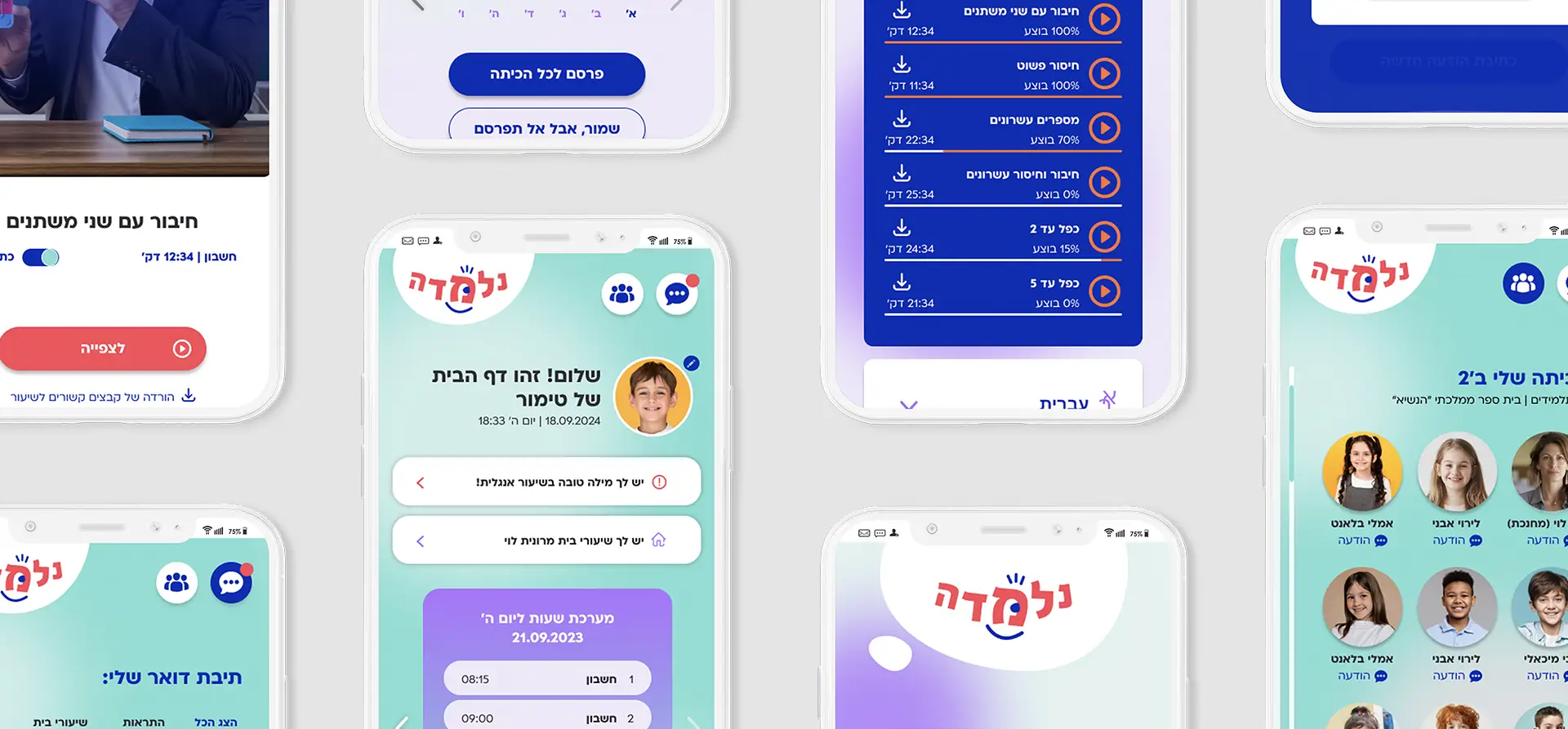
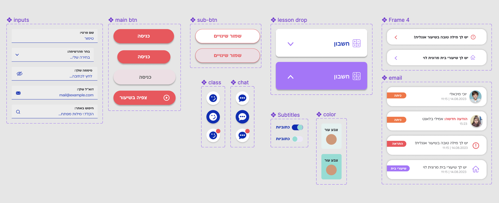
Establishing Visual Design
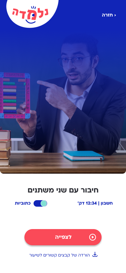
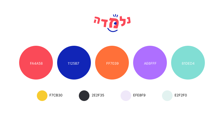
In addition to the visual language and UI kit of the application, I created the logo and color palette for it. I aimed to convey the interface’s lightness through colors, shapes, and rounded fonts—speaking the language of children but on their eye level.
Lessons Learned
Time and Accessibility are Key Factors Parents want to stay in the loop about what’s happening with their children when they are at school. However, they cannot invest too much time due to a fast-paced lifestyle.
Data Assurance One of the most crucial aspects for the school. A third-party application cannot guarantee this.
Being Part of the Community It is important for both parents and teachers to give and receive additional values through a school app, beyond regular communication and information transfer.
Children are a Potential Target Audience Many parents are willing to relinquish constant supervision of their children’s school achievements for an app that transparently and accessibly conveys information. Children can independently access the app and receive vital information such as homework assignments and educational videos.